The Dynamic Charts widget in the DynamicKit for Elementor plugin allows you to create a variety of interactive charts powered by dynamic data.
Overview#
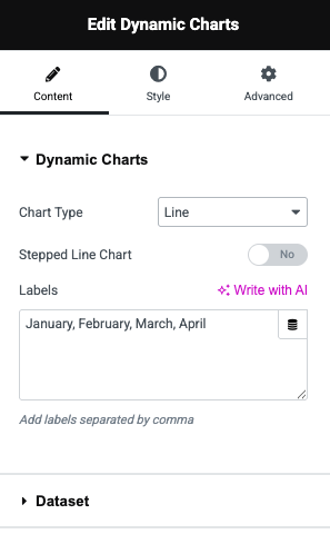
Chart Type#
Select the type of chart you want to display. The widget supports a wide range of chart formats:
- Line – Ideal for showing trends over time.
- Bar – Good for comparing quantities across categories.
- Radar – Visualizes multivariate data on axes starting from the same point.
- Pie – Displays parts of a whole as slices.
- Doughnut – Similar to Pie but with a hollow center.
- Polar Area – Like a radar chart, but with segment angles representing values.
- Bubble – Represents three dimensions of data using x, y, and size.
Stepped Line Chart#
A toggle that enables stepped line rendering for line charts. This makes the line take right-angle steps rather than diagonal curves—useful for visualizing changes that happen in stages (e.g., thresholds or status changes).
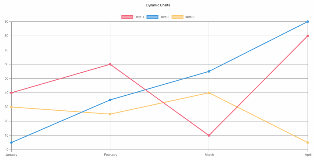
Labels#
Input field for adding chart labels, typically used for the X-axis or as legends.
- Labels should be entered as a comma-separated list (e.g.,
January, February, March). - These labels correspond to the dataset values and help viewers understand what each data point represents.
Datesets#
Datasets allow you to manage and customize the data series that feed into your chart.
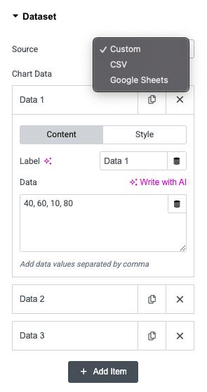
Source#
Defines the origin of the chart data. You can choose from:
- Custom – Manually enter values directly in the widget.
- CSV – Import data from a CSV file.
- Google Sheets – Connect to a Google Sheet for live or remote data.
Chart Data#
This area appears when you select "Custom" source. It manages individual datasets (like Data 1, Data 2, Data 3), each representing a separate data series in the chart.
Content#
Label
- Sets the name of the dataset (e.g., "Revenue", "Visitors", "Sales").
- This label appears in the chart legend and helps differentiate between datasets.
Data
- Enter values separated by commas (e.g.,
40, 60, 10, 80). - Each number corresponds to a point on the chart, aligned with the labels defined earlier (e.g., months or categories).
Style#
The Style tab under the individual item provides visual customization options for each dataset. Here's a detailed overview of the available features.
Background Color
- Sets a solid background color for the dataset (applies to elements like bars, filled lines, and slices).
- Color picker or hex value input supported.
- Useful for Line, Bar, Radar, Pie, Doughnut, and Polar Area charts.
Fill (Toggle)
- When enabled, fills the area below a line in Line or Radar charts.
- Creates a more pronounced visual effect between data points and the axis baseline.
Border Dash (Toggle)
- Enables dashed outlines for lines in Line or Radar charts.
- Adds visual distinction to datasets without relying solely on color.
Background Colors (Multiple)
- Allows setting multiple background colors for segmented charts like:
- Pie
- Doughnut
- Polar Area
- Add comma-separated values like:
#EC6E8599, #569FE599, #F7C6B99, #F0964099
Border Colors (Multiple)
- Similar to background colors, but for the borders of each segment.
- Add comma-separated hex values to match or contrast with background colors.
These options help you create visually distinct and brand-aligned charts that are both informative and engaging.
Legend#
Allows you to control the visibility and placement of the chart legend, which helps users understand what each data series or segment represents.
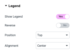
Show Legend: When enabled, it displays dataset labels (like "Data 1", "Sales", etc.) alongside matching colors or icons.
Reverse: Reverses the order of the legend items. Useful for flipping the display direction, especially in stacked or sequential data visualizations.
Position: Defines where the legend appears in relation to the chart:
- Top – Above the chart.
- Bottom – Below the chart.
- Left – To the left of the chart.
- Right – To the right of the chart.
Alignment: Controls horizontal alignment of the legend within its position:
- Start – Aligns the legend to the left (or top, if vertical).
- Center – Centers the legend.
- End – Aligns the legend to the right (or bottom, if vertical).
Tooltip#
Allows you to configure interactive tooltips that appear when users interact with chart elements. Tooltips are useful for showing precise data values and improving readability.
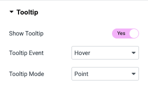
Show Tooltip: When enabled, hovering or clicking on chart elements will display data details.
Tooltip Event: Defines the user interaction that triggers the tooltip:
- Hover – Tooltip appears when the user hovers over a data point.
- Click – Tooltip is shown when the user clicks on a data point.
Tooltip Mode: Controls how tooltips behave and what data they show:
- Point – Displays the value of a single data point that the cursor is directly over.
- Index – Shows all values across all datasets for the hovered index (e.g., all series values for "March").
- Dataset – Displays values for the entire dataset when any of its points are hovered or clicked.
Chart Title#
Allows you to configure the main title displayed above or around the chart. This helps provide context to viewers by summarizing what the chart represents.
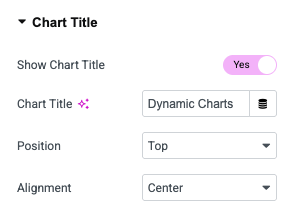
Show Chart Title: When enabled, a title is displayed based on the text you enter below.
Chart Title: Input field for setting the title text (e.g., "Monthly Sales", "User Growth"). It can also accept dynamic tags or tokens for dynamic data injection.
Position: Specifies where the chart title appears relative to the chart area (Top, Bottom, Left, Right)
Alignment: Controls how the title is aligned within its container (Start, Center, End)
Additional Options#
It offers advanced customization for chart behavior, axis settings, line styling, and animations.
Chart Display Settings#
- Begin at Zero: Forces the Y-axis to start at 0, ensuring a more accurate visual comparison of values.
- Step Size: Controls the interval between tick marks on the Y-axis.
- Maintain Aspect Ratio: Ensures the chart maintains its original width-to-height ratio on different screen sizes.
X Axis Options#
- Show Grid Lines: Toggles the horizontal grid lines for better visual reference.
- Show Labels: Enables or disables labels (e.g., months, categories) on the X-axis.
- Show Title: Displays a custom title for the X-axis if enabled.
Y Axis Options#
- Show Grid Lines: Toggles vertical grid lines for the Y-axis.
- Show Labels: Enables or disables numerical labels along the Y-axis.
- Labels Prefix / Suffix: Adds custom text before or after Y-axis values (e.g.,
$,%,kg). - Show Title: Option to display a custom title for the Y-axis.
- Minimum Value / Maximum Value: Define fixed Y-axis bounds. If left blank, the chart automatically adjusts based on data.
Line Chart Customization#
- Line Tension: Controls the curve smoothness of lines. A lower value creates straighter lines, while a higher value adds more curvature.
Animation Settings#
- Animation: Select the animation easing function (e.g.,
easeOutQuart) to define the motion style as the chart appears. - Duration: Sets the animation time in milliseconds (e.g.,
1000= 1 second). - Loop Animation: When enabled, the chart animation repeats in a continuous loop.